Yangtse — bilingual incense packaging
Tibetan and English typography carried across the faces of a richly illustrated retail carton.
Archival client artwork · Digital mockup
Tibetan and English typography carried across the faces of a richly illustrated retail carton.
Archival client artwork · Digital mockup
Give an incense carton a distinctive product identity while accommodating Tibetan and English text, product information and manufacturer details.
Packaging graphic design, multilingual typography and carton-artwork preparation.
The artwork must work across long, shallow carton faces, with folds, closure flaps and several reading directions.
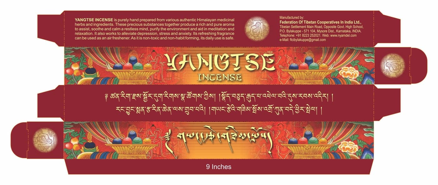
The retained flat carton artwork shows the panel arrangement and production layout. The folded view is a digital mockup made from that same artwork. No physical pack photograph or production outcome is claimed. Product statements are reproduced as historical artwork.