Fitness Centre — from mark to stationery
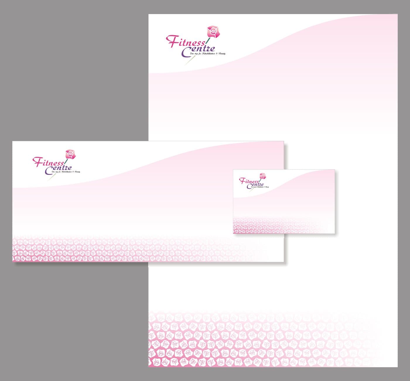
A compact identity extended through a coordinated letterhead, envelope and card presentation.
Archival identity presentation
A compact identity extended through a coordinated letterhead, envelope and card presentation.
Archival identity presentation
Create a recognisable identity for Fitness Centre and carry it into everyday business materials.
Logo design and identity application across stationery layouts.
The mark needs to hold together at stationery scale, with a consistent graphic language across different paper formats.
The retained logo and stationery presentation show the identity and its proposed applications. The arranged stationery view is a presentation mockup, not evidence of manufactured items.